You have a fascinating dataset, and you want to create an eye-catching, easily understandable visualization—how do you choose a color palette? In addition to using a colorblindness simulator to ensure accessibility, you can use best practices revealed by research in cognition and psychology.
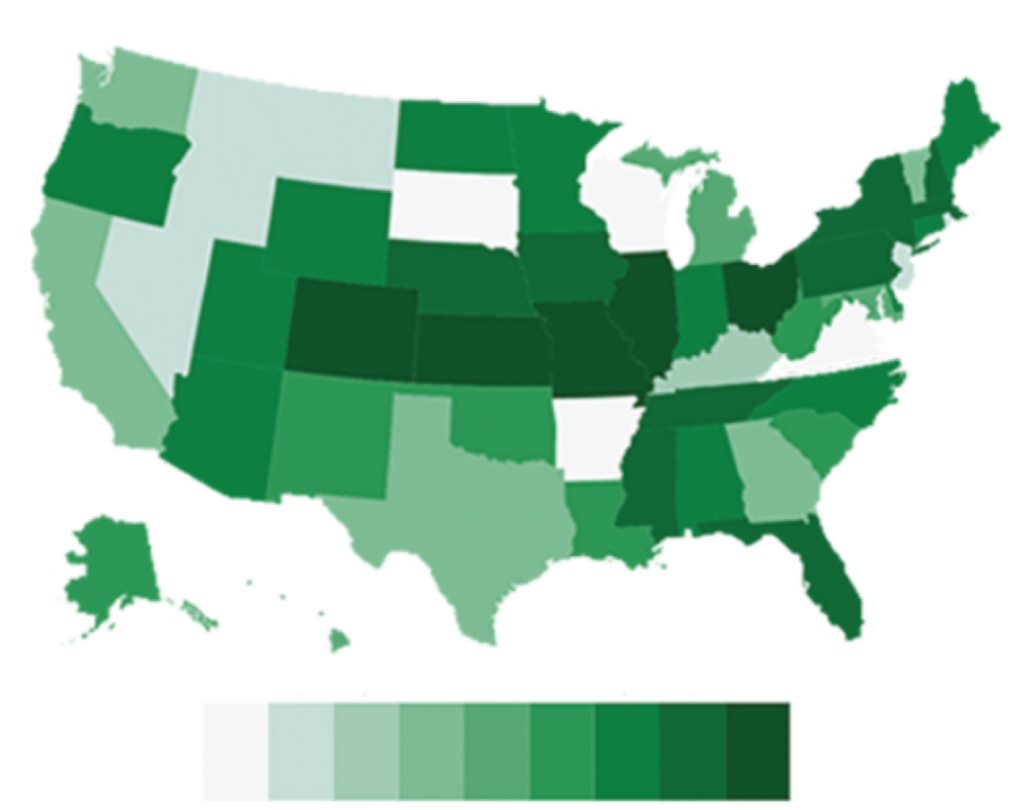
You’ve likely seen countless visualizations that represent continuous data using a rainbow colormap, with colors spanning the entire rainbow. Unfortunately, in such designs, equal steps in numerical value do not correspond to equal steps in perceived color difference, and the lightness of the colors varies inconsistently across the rainbow, interfering with people’s perceptions of trends (Borland & Taylor, 2007). Instead, try creating a gradient with Color Crafter, which avoids those problems (Smart et al., 2020). If your data has only positive values, use light hues for small values and dark hues for larger values to leverage our dark-is-more cognitive bias (Schloss et al., 2019). If your data ranges above and below zero (or another neutral point), you can combine two Color Crafter palettes that share their lightest color, for example using blue hues for positive values and red hues for negative values.
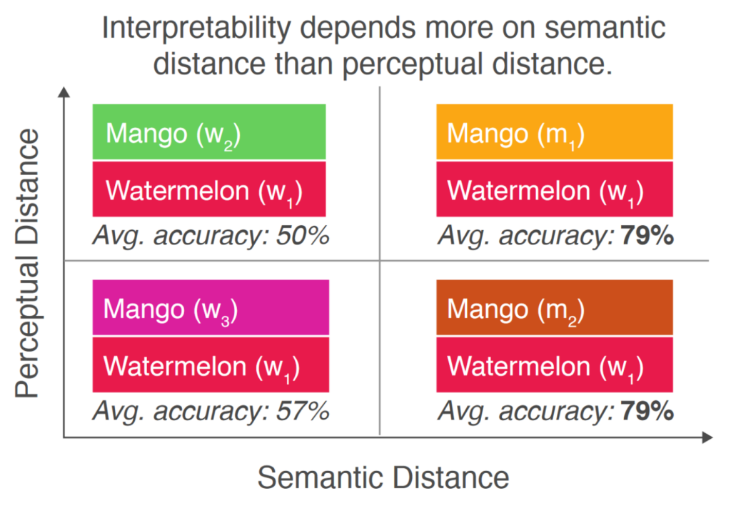
What about categorical data? When possible, your palette should match people’s intuitive color-concept associations for the entire set of categories (Schloss et al., 2018; 2021). For example, purple=grapes and red=apples is easier to interpret than green=grapes and red=apples, since apples can also be green. For more abstract data, try using Colorgorical, another empirically informed tool (Gramazio et al., 2017). Colorgorical generates palettes with perceptually distinguishable colors that are aesthetically pleasing together—often more aesthetically pleasing than the palettes offered by ColorBrewer, Microsoft, and Tableau.

Regardless of your data type, keep in mind that the color palette will influence the emotions of viewers (Bartram et al., 2017). Palettes with light, unsaturated, cool (pastel) colors are calm, while those with dark, unsaturated, cool colors are negative. Avoid using dark red or brown if you want to evoke positive feelings, and avoid using light, highly saturated colors if you want to create a serious mood.
Feel free to reach out to Scott Hershberger if you’re having trouble accessing any article mentioned here.


Leave a Reply